
Decide what the mobile page must achieve
AMP or a constrained mobile template is a delivery choice, not a content strategy. Start by listing the jobs the page must still perform: explain the offer, show proof, answer common questions, capture a lead, or start a course or webinar registration.
- Which blocks are essential on a phone?
- Which interactions (forms, filters, media) must remain?
- What can move to a linked full page without breaking trust?
If those answers are unclear, improve the standard responsive template first using the WordPress performance guide before adding another rendering path.

Keep the essential journey intact
Mobile users still need clear headings, key information, navigation, forms, validation messages, and meaningful confirmation. Removing these to make a page lighter can make it less useful even when its score improves.
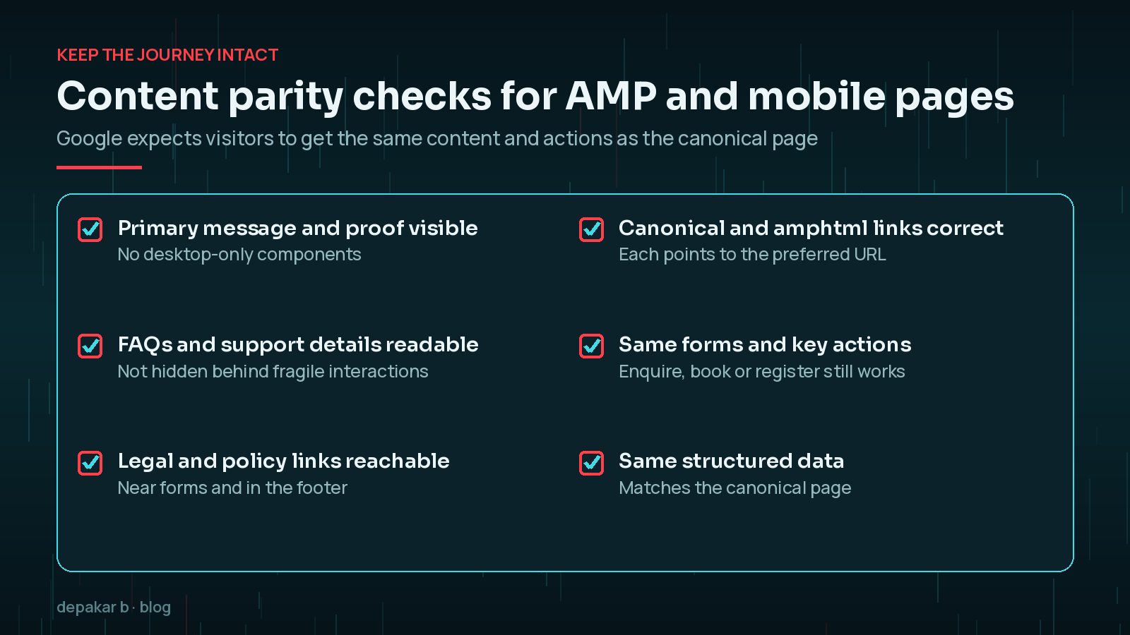
Content parity checks
- Primary message and proof appear without desktop-only components
- FAQs or support details remain readable, not hidden behind fragile interactions
- Legal and policy links stay reachable near forms and footers
- Canonical and AMP relationship signals point to the preferred URLs
Google's own AMP guidelines make the same point: visitors should be able to experience the same content and complete the same actions on an AMP page as on its canonical page, where possible. A stripped-down page that drops the enquiry form or the key proof is not a faster version of your page; it is a different, weaker page.
Test forms, confirmation, and tracking
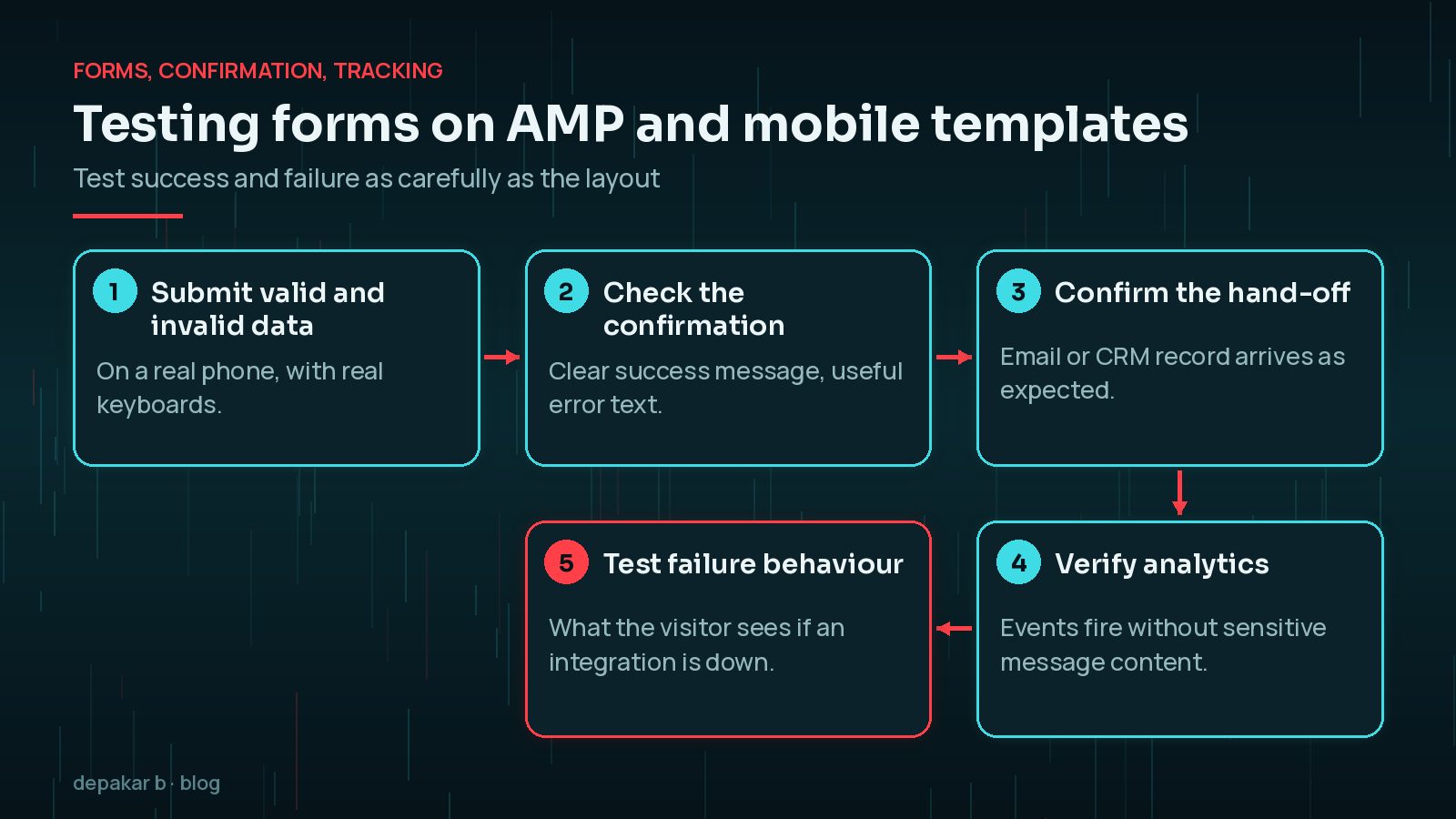
AMP or lightweight pages need separate validation for form submission, confirmation states, analytics events, and consent. Test success and error states as carefully as the visual layout.
- Submit valid and invalid data on a real device
- Confirm the success message and any email or CRM hand-off
- Verify analytics events fire without exposing sensitive message content
- Document failure behaviour when an integration is unavailable
For planning those hand-offs, use planning WordPress forms and integrations and the service overview for forms and integrations work.
Review the page as a visitor
Check it on a real small screen with typical network conditions. The page should load, explain its purpose, support the expected action, and return a clear result without asking the visitor to switch to another version mid-task.
- Thumb reach for primary CTAs
- Readable type and spacing without horizontal scroll
- Media that does not block interaction
- Consistent branding so the AMP or mobile view still feels like the same site
For tap targets, WCAG 2.2 sets a minimum of 24 by 24 CSS pixels (or enough spacing around smaller targets) at level AA. Treat that as a floor, not a goal: primary buttons on a phone should be comfortably larger and well away from other links.

Maintain AMP alongside the main site
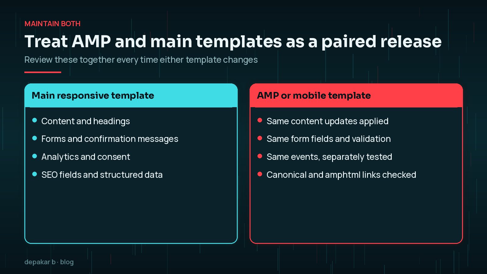
When both templates exist, treat updates as a paired release: content, forms, tracking, and SEO fields should be reviewed together. A desktop improvement that never reaches the mobile template creates uneven journeys and confusing analytics.
Pair this work with the technical SEO checklist so crawlability and canonicals stay correct, and with technical work examples when you want to see how AMP-related delivery shows up across projects.
Do you still need AMP in 2026?
For most WordPress sites, AMP is now an option rather than a requirement. Google's documentation says it indexes AMP pages like any other page and applies the same standard to all pages, whatever technology built them. AMP pages can still appear as rich results, but so can well - built responsive pages. Google also notes that AMP on desktop does not get search-specific features in results.
That changes the question from "do we need AMP?" to "does AMP solve a problem our main template cannot?" If your responsive pages already load quickly and respond well on phones, a second rendering path mainly adds maintenance. If your theme is heavy and a rebuild is not possible yet, AMP or a lighter mobile template can be a reasonable stopgap, as long as it keeps the full journey.
Which page experience signals matter on mobile?
Google says there is no single page experience signal. Its page experience guidance asks a set of questions instead: do pages have good Core Web Vitals, are they served securely over HTTPS, do they display well on mobile, do they avoid intrusive interstitials and excessive ads, and can visitors easily tell the main content apart from everything else?
For Core Web Vitals, the published "good" thresholds are measured at the 75th percentile of page loads:
- Largest Contentful Paint (LCP): within 2.5 seconds.
- Interaction to Next Paint (INP): 200 milliseconds or less.
- Cumulative Layout Shift (CLS): 0.1 or less.
Mobile is usually where these fail first, because phones have slower processors and less reliable networks. INP in particular suffers from heavy scripts and page builders; my guide to fixing INP on WordPress covers the usual causes. The broader WordPress performance guide helps with LCP and CLS.
How do you retire AMP pages safely?
If you decide your responsive template is good enough, you can remove AMP without losing the canonical pages. Google's documentation on removing AMP content describes the steps for a site with paired AMP and non-AMP pages:
- Remove the
rel="amphtml"link from each canonical page, for example by deactivating the AMP plugin or turning off its AMP versions. - Redirect each old AMP URL to its canonical page with a 301 (or 302) redirect, so links and bookmarks keep working.
- Do not empty AMP pages of content; Google treats blank documents as invalid and may keep serving an older version.
- Watch the AMP status report in Search Console for indexed AMP pages trending down.
Before you switch, test the responsive template on the same real devices and journeys you used for AMP. Retiring AMP should feel invisible to visitors, apart from one less version of the site to maintain.
Frequently Asked Questions
Does Google still require AMP for mobile rankings?
No. Google indexes AMP pages like other pages and applies the same standard to all of them. A fast, well - built responsive page can do just as well as an AMP page.
Is AMP worth using on a WordPress site?
It can help when the main theme is slow and cannot be rebuilt quickly, but it adds a second template to maintain. If your responsive pages already have good Core Web Vitals, AMP usually adds more work than benefit.
What is content parity on AMP pages?
It means the AMP page offers the same important content and actions as its canonical page, such as key information, proof, forms and policy links. Google's AMP guidelines expect this where possible.
How do I remove AMP from WordPress without losing traffic?
Remove the amphtml link from canonical pages, redirect each AMP URL to its canonical page with a 301, and monitor the AMP status report in Search Console as AMP pages drop out of the index.
What are good Core Web Vitals scores on mobile?
Google's published good thresholds are LCP within 2.5 seconds, INP of 200 milliseconds or less, and CLS of 0.1 or less, measured at the 75th percentile of page loads.
Final Thoughts
A good mobile page experience is not a score or a technology choice. It is a page that loads quickly on a real phone, explains its purpose, keeps the forms and proof a visitor needs, and confirms what happens next. Whether you use AMP, a lighter template or a well-optimised responsive theme, judge it by that complete journey. If your mobile pages are slow or losing enquiries, my speed and performance service focuses on exactly this.
Official References
Sources checked on 29 October 2026: